
Standard Banking Demo: Discovering Entando CMS Components
Here’s the last blog post in the Standard Banking Demo series. After a deep dive into the microservices and micro frontends, we are now discovering the CMS components that make up this banking application and how we can manage our content to provide a great user experience.
Hey my fellow developers,
Here’s the last blog post in the Standard Banking Demo series. After a deep dive into the microservices and micro frontends, we are now discovering the CMS components that make up this banking application and how we can manage our content to provide a great user experience.
This blog post is part of the Entando Standard Banking Demo series:
- Standard Banking Demo: Introduction
- Standard Banking Demo: JHipster Generated Microservices and Micro Frontends
- Standard Banking Demo: Discovering Entando CMS Components
Content Management: The Standard Demo Banner
Compose Components to Display a Banner
In the Standard Banking Demo, banners are defined to display pieces of content in pages rendered in a modern website style.
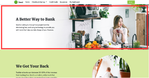
We will use this content type to explain how an Entando application leverages CMS components to build composable applications.
CMS component architecture
To manage content, we need to know how to define it (the Type), how to display it (the Model), and how to create a new instance (the Content).
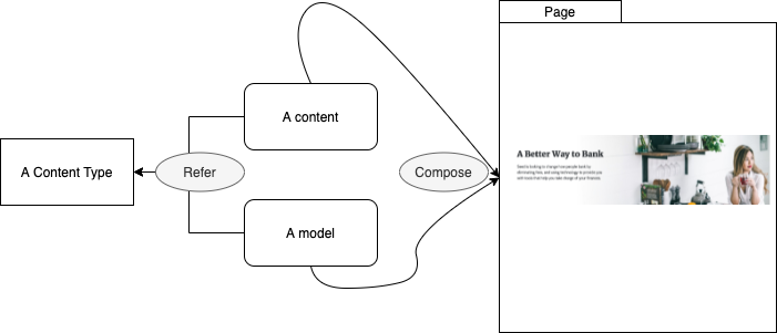
Content Type
The ContentType defines the attributes available when adding a new instance of content. The type is defined by a name and a code and defines fields and rules to apply.
Each attribute has a code, a name, and a type. Attributes can be mandatory and be used to filter content.
Content Template
The Content Template defines how a ContentType is displayed. A ContentType can be displayed in different ways by creating additional Content Templates.
Content
The Content refers to a piece (or instance) of content and is based on a ContentType. The Content defines the values of the attributes for a ContentType.
Assets
A collection of assets you can use in a piece of content and share across multiple content entries, e.g. an image.
When a page is designed, the Content widget is configured to render a piece of content based on the Content Template.
Compose components in the App Builder
In the Page Designer, this content is placed in a frame as a “Content” widget. Here in red, the Content widget is used to display the main banner on the homepage.
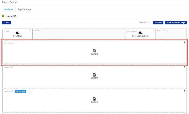
This widget is configured to display the content you want to display along with the desired content template.
In this case, the Home SD page contains multiple Content widgets that all use the same content type (SDB).
Although the Content Type is the same, each section is rendered differently by choosing different Content Templates. There is a content template for displaying the main banner, another for displaying a light background, and another to render an accordion inside the banner.
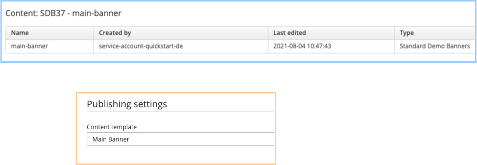
The content to display can be selected from the Settings menu in the kebab menu.

Then we can select the content we want to display (displayed below in blue) and the template we want to use for this instance of content (in orange).
Only a template linked to the same content type can be used.
All of the CMS components are defined as code in the Standard Banking Demo.
CMS Components as Code
The Standard Demo Banner: Content Type
code: SDB name: Standard Demo Banners status: '0' attributes: - code: title type: Text names: en: title roles: [] disablingCodes: [] mandatory: true listFilter: false indexable: true validationRules: minLength: null maxLength: null regex: null rangeStartString: null rangeEndString: null rangeStartStringAttribute: null rangeEndStringAttribute: null equalString: null equalStringAttribute: null rangeStartDate: null rangeEndDate: null rangeStartDateAttribute: null rangeEndDateAttribute: null equalDate: null equalDateAttribute: null rangeStartNumber: null rangeStartNumberAttribute: null rangeEndNumber: null rangeEndNumberAttribute: null equalNumber: null equalNumberAttribute: null ognlValidation: null ...
The Standard Demo Banner: Template
The template references the content type through the contentType field: SDB
id: 1 contentType: SDB description: Main Banner contentShape: |- <div class="main-banner"> <div class="row"> <div class="col-lg-6 col-xs-12 main-banner-center"> <div class="text-wrapper"> <h1> $content.title.text</h1> <p>$content.subtitle.text</p> </div> </div> </div> </div>
The Standard Demo Banner: Content
The content references the content type through the typeCode field: SDB
id: SDB37 typeCode: SDB description: main-banner mainGroup: free status: PUBLIC attributes: - code: title value: null values: en: A Better Way to Bank elements: [] compositeelements: [] listelements: {} ...
The Standard Demo Homepage
The page template defines the widgets on the page like the Content widget: code: content_viewer
The Content widget is then configured to display the top banner using the contentId SDB37 and the template 'modelId: 1'.
code: homepagesd parentCode: homepage titles: en: Home SD it: Home SD pageModel: seed_home ownerGroup: free joinGroups: [] displayedInMenu: true seo: false charset: utf8 status: published widgets: - code: Brand-Logo config: null pos: 0 - code: Login_buttons config: null pos: 2 - code: content_viewer config: contentDescription: main-banner modelId: '1' ownerGroup: free contentId: SDB37 joinGroups: '[]'
Conclusion
This series is ending with the CMS Standard Banking Demo overview, it provides a working example of how traditional micro frontends can be composed alongside CMS components. The banner example is great to understand how a given content type can be used in multiple ways to render different content using the same attributes and improve your capacity to deliver content quickly and easily.
User-editable content can also be exported using the bundle export/import feature and managed as code along with micro frontends and microservices across multiple environments or clusters.
Now it’s time to play with the Standard Banking Demo. Be sure to follow our documentation and reach out on the Entando forum for feedback.
