Using Angular to create a Micro Frontend
Disclaimer
This article has been written with the help of the ModSquad Community. The related live session is available here:
Introduction to Web Components
Web components are a set of technologies, a meta- specification, with reusable isolated elements that make up a web application.
Basically, Web Components need 4 specifications:
- Custom Elements: A set of Javascript APIs to define the components and their behaviors.
- Shadow DOM: A set of APIs to render the element into a dedicated and isolated DOM.
- HTML Templates: Allows you to use <template> and <slot> tags to define a portion of HTML to reuse in which slots could be filled with variable content.
- ES Modules: A specification to import and use Javascript Modules to create an agnostic modular approach.
Modern Javascript frameworks offer some solutions to easily create a web component, using a custom element, leveraging all the framework features, and creating small business-oriented apps. This is what we call micro frontends.
Let’s see how to proceed using Angular and let’s see how to create our first micro frontend.
To continue, you need to have installed NodeJS (including npm) and the Angular CLI npm install -g @angular/cli
Initiate the Project
Here we go. We are going to create our first web component using Angular. For this first exercise, let’s create a card to describe people in our community. We call it “social card”.
With your favorite terminal, create a new Angular project
ng new social-card
Create an Angular Component
- Add Angular material
Because we want to use the Angular Material library to create our component, we need to add it as a dependency on our project. During the installation, I select the default values.
ng add @angular/material
- Create the Material Card Component
From the example section of the Card component, I choose to implement the “Card with multiple sections” one. https://material.angular.io/components/card/examples
First, I create a new Angular component. Please note “components” here refer to the Angular Component, not Web Components defined in the introduction.
ng generate component card
The Angular CLI automatically creates all the needed files and updates the different files to make the application work out of the box.
In the src/app/card/ folder, open the HTML file and copy the following code into it:
<mat-card class="example-card"> <mat-card-header> <div mat-card-avatar class="example-header-image"></div> <mat-card-title>John Doe</mat-card-title> <mat-card-subtitle>Dev Adcovate</mat-card-subtitle> </mat-card-header> <img mat-card-image src="https://material.angular.io/assets/img/examples/shiba2.jpg" alt="Photo of a Shiba Inu"> <mat-card-content> <p> The Shiba Inu is the smallest of the six original and distinct spitz breeds of dog from Japan. A small, agile dog that copes very well with mountainous terrain, the Shiba Inu was originally bred for hunting. </p> </mat-card-content> <mat-card-actions> <button mat-button>LIKE</button> <button mat-button>SHARE</button> </mat-card-actions> </mat-card>
Then, open the CSS file and copy the following code:
.example-card { max-width: 400px; } .example-header-image { background-image: url('https://material.angular.io/assets/img/examples/shiba1.jpg'); background-size: cover; }
- Import Angular Material Modules in your App Module
Then, open the src/app/app.module.ts to import the MatCardModule and the MatButtonModule.
import {MatCardModule} from '@angular/material/card'; import {MatButtonModule} from '@angular/material/button';
imports: [ MatCardModule, MatButtonModule
- Run your application
Edit the app.component.html file from the src/app folder and replace the existing with the following:
<app-card></app-card>
You can start your application by running the following command at the project root level:
ng serve

So far, so good, but the following application is not yet a Web Component and we need to make some changes to transform it.
Transform the Application into a Web Component
- Add Angular elements dependency
Angular elements is the name in the Angular ecosystem for custom elements. This dependency allows us to easily create a custom element from our existing application.
ng add @angular/elements
- Update the app.module.ts
From the src/app/app.module.ts file, update the constructor, call the createCustomElement() method, and define the custom element tag, ng-social-card.
import {createCustomElement} from '@angular/elements';
export class AppModule { constructor(private injector: Injector) { const el = createCustomElement(AppComponent, { injector }); customElements.define('ng-social-card', el); } ngDoBootstrap() { } }
Remove the AppComponent in the bootstrap array. we don’t need it anymore and it could generate errors in the console log.
- Update the index.html
Open the src/index.html file and change the content to use the custom-element instead of the initial value.
<body> <ng-social-card></ng-social-card> </body>
We have now instantiated the application, using a custom element instead of the regular app-root tag.
Start the application again using ng serve and check that the application is still working.
Build and Run Your Web Component
Build it!
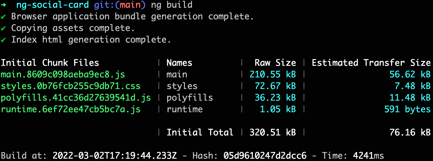
To build your component you have to run the following command:
ng build

A dist folder is now created containing an HTML file and all the Javascript and CSS files.
If you open the index.html, you can see it contains the custom elements previously defined.
<head> <meta charset="utf-8"> <title>NgSocialCard</title> </head> <body> <ng-social-card></ng-social-card> <script src="runtime.6ef72ee47cb5bc7a.js" type="module"></script> <script src="polyfills.41cc36d27639541d.js" type="module"></script> <script src="main.8609c098aeba9ec8.js" type="module"></script> </body>
Run it!
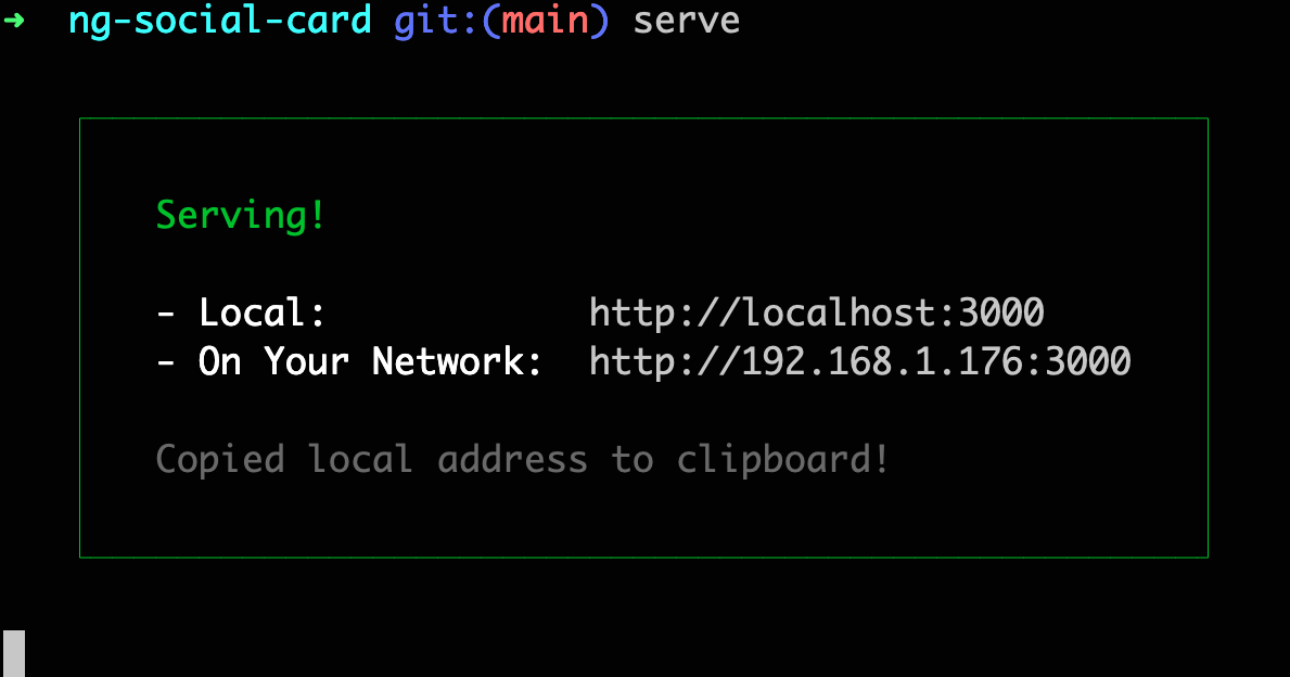
To run it, you can install serve through npm to start a lightweight web server.
npm install -g serve
And from the dist/ng-social-card folder, run the following command:
serve

The application is available at http://localhost:3000

Congratulations! You’ve just created your first micro frontend using Angular.
Resources
All the code is available at the repository: https://github.com/avdev4j/ng-social-card
Find more micro frontends videos on our YouTube channel: https://www.youtube.com/c/EntandoVideos
Join us on Discord to share and learn about Composable apps: https://discord.gg/SdMCvyzzHm
